From the Drop Zones panel, hover the cursor over the name of the metric you want to define a threshold on, then click the arrow icon on the right. A list of options is displayed.
Select Thresholds. The Threshold dialog box opens.
From the Show drop-down list, select the type of threshold you want to define, as follows:
To create a threshold to change the background color used to display the metric, select the color you want to display.
To replace the data with an image, select the image you want to display. The options include:
Arrows

Regular Pin

Rounded Pin

From the Based on drop-down list, select the metric to use to define the threshold.
From the drop-down list, select one of the following:
To create a threshold based on the value of the metric, select Value. For example, you can display metric values greater than 5 million in blue.
To create a threshold based on the top x metric values, select Highest. For example, you can display the top 5 metric values in red.
To create a threshold based on the bottom x metric values, select Lowest. For example, you can display the bottom 5 metric values in green.
To create a threshold based on the top x percent of metric values, select Highest %. For example, you can display the top 10% of metric values with a green flag.
To create a threshold based on the bottom x percent of metric values, select Lowest %. For example, you can display the bottom 50% of metric values with a red flag.
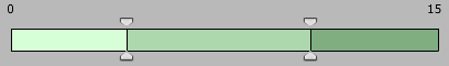
Each band displayed in the dialog
box represents a different range of values. You can click and drag an
indicator left or right along the slider to increase or decrease the range
of values covered by the band.
Do one of the following:
To create a new band, press CTRL and click a band to divide it into two separate bands.
To change the color applied to the range of values covered by a band, double-click the band, then select the new color from the palette.
To delete a band, hover the cursor over the band, then click the x icon. The band is deleted.
Click OK. The threshold is created.