You can track changes in the status of multiple business assets, as well as important events affecting each asset, using the Timeline widget for the iPad. For example, your business owns multiple airplanes, which you lease out to different airlines. During the time you own an airplane, the leasing status of the airplane may change. The airplane may be loaned to a different airline or be kept on the ground without being used. Other events may occur in the lifetime of the asset, such as the airplane being sold off or an airline choosing to extend its current lease on the airplane.
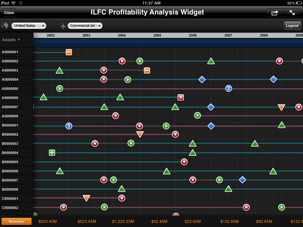
In the image below, each of the horizontal lines displayed in the timeline represents a different commercial jet. The lines are colored differently depending on their lease status. For example, periods in which planes are not currently leased are represented with a gray line. An icon is displayed along the line if an event has occurred to the airplane at a specific point in time, such as the airplane being sold, or the airplane being leased to a new company. There are metric values displayed at the bottom row of the widget, with a separate value displayed for each year, as well as metric values displayed in the rightmost column of the widget, with a separate value displayed for each asset.
You can choose to display a number badge to represent periods in the timeline in which more than one event happened to an asset. For example, if an airplane's lease ran out in Q1 of 2010 and it was also sold during that time, you can have the widget display a badge containing the number 2 instead of an event icon, as shown in the image below.
You can choose to display an Information Window with additional information when a user taps the section of a timeline for a specific asset and quarter, or the name of an asset in the list of assets. For steps to define an Information Window, see To define an Information Window for a Timeline widget.
Open the document in Design or Editable Mode.
From the Insert menu, point to Widgets, then Mobile. Select Timeline, then click the area in the document layout area in which you want to place the widget.
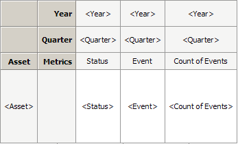
Place attributes and metrics on the widget's Grid/Graph, as described in the following steps. An example of the Grid/Graph of a Timeline widget is displayed in the image below.
Place an attribute on the rows of the widget's Grid/Graph. This attribute must contain an attribute element for each asset you want to display in the widget.
Place
attributes and metrics on the columns, as follows:
Note: Each of the metrics on the widget's Grid/Graph should
contain a single value for each combination of the asset, year, and quarter
attributes. In the example above, the status metric should contain a status
value for each airplane for Q1 2010, Q2 2010, Q3 2010, and so on.
The first attribute contains each year for which you want to display data.
The second attribute contains each quarter for which you want to display data.
The first metric is the status metric, which contains values representing the status of each asset. You can define a threshold on this metric to change the color of the line used to display each asset in the widget based on the asset's status. In the example above, the line for each airplane is colored differently depending on its leasing status.
The second metric is the event metric, which contains values representing the events that affect each asset displayed in the widget. You can define a threshold on this metric to display an icon on top of the line for an asset, which marks when specific events have occurred. In the example above, a circular green icon is displayed when an airplane begins a lease.
The third metric (optional) is the count of events metric, which contains the number of events that occurred to each asset for every combination of year and quarter displayed in the widget. If this value is greater than 1 for a specific quarter, a number badge for the quarter is displayed in the widget in place of an event icon. This number badge contains the number of events that affected the asset during the quarter.
To color-code the line for each asset in the widget based on the asset's status, you must define a threshold on the status metric to automatically change the color in which metric values are displayed. You can display a dashed line by defining the threshold to display the metric values as a Quick Symbol. Right-click the widget's Grid/Graph, then point to Thresholds and select Visual. The Visual Threshold Editor opens. Select the appropriate options to define your threshold. For detailed steps to define a threshold, see the Formatting a Report chapter in the Basic Reporting Guide.
To display an image icon when an event occurs to an asset in the widget, you must define a threshold on the event metric to automatically replace metric values with the image you want to display. Right-click the widget's Grid/Graph, then point to Thresholds and select Visual. The Visual Threshold Editor opens. Select the appropriate options to define your threshold. For detailed steps to define a threshold, see the Formatting a Report chapter in the Basic Reporting Guide.
You can define an Information Window to be displayed when a user taps the section of the timeline for a specific asset and quarter. Create a panel stack containing the information you want to display, then define the Asset, Year, and Quarter attributes as selectors that target the panel stack. For detailed steps to define the Information Window, see To define an Information Window for a Timeline widget.
Defining the grid for displaying metrics by asset
From the Insert menu, select Grid, then click the area in the document layout area in which you want to place the grid. This grid will not be visible when the widget is displayed, and will be used to display metrics by asset in the rightmost column of the widget.
Place attributes and metrics on the grid as follows:
Place the attribute containing each asset in the widget on the rows.
Place metrics on the columns. These metrics will be displayed in the right-most column of the widget, with a separate value displayed for each asset in the widget. Each value is aggregated across all years for which there is data available. For example, you can choose to display cost data in the right-most column of the widget. The first metric value in the column will contain the cost for the first asset, taken across all years displayed in the widget, the second metric value will contain the cost for the second asset taken across all years displayed in the widget, and so on.
You can define an Information Window to be displayed when a user taps the name of an asset in the widget. Create a panel stack containing the information you want to display when the user taps the asset's name, then define the asset attribute as a selector that targets the panel stack. For detailed steps to define the Information Window, see To define an Information Window for a Timeline widget.
Defining the grid for displaying metrics by year
From the Insert menu, select Grid, then click the area in the document layout area in which you want to place the grid. This grid will not be visible when the widget is displayed, and will be used to display metrics by year in the bottom row of the widget.
Place attributes and metrics on the grid as follows:
Place the attribute containing each year in the widget on the rows.
Place metrics on the columns. These metrics will be displayed in the bottom-most row of the widget, with a separate value displayed for each year in the widget. Each value is aggregated across all assets for which there is data available. For example, you can choose to display revenue data in the bottom-most row of the widget. The first metric value in the row will contain the revenue for the first year in the widget taken across all assets displayed in the widget, the second metric value will contain the revenue for the second year taken across all assets displayed in the widget, and so on.
Right-click the Grid/Graph of the Timeline widget, then select Properties and Formatting. The Properties and Formatting dialog box opens.
From the left, click Widget.
In the Available list under Secondary Data Providers, select the grid with the asset attribute, then click > to move it to the Selected list. Select the grid with the year attribute and click > to move it to the Selected list.
Click the Widget
Properties icon  . The Timeline Properties dialog box opens.
You can choose the starting point from which to display data in the timeline when the widget is displayed on a mobile device. From the Initial column display properties drop-down list, select one of the following:
To display data in the timeline starting with the most recent dates available, select Right Justified.
To display data in the timeline starting with the earliest dates available, select Left Justified.
You can determine whether to show labels for each quarter displayed in the timeline. Do one of the following:
To show the labels for each quarter, select the Show labels check box.
To display the timeline without labeling each quarter, clear the Show labels check box.
Click OK to save your changes and return to the Properties and Formatting dialog box.
Click OK to save your changes.
You can define Information Windows to display additional information when the user taps an area in the widget when the widget is displayed on the mobile device. To do so, you must first define a panel stack containing the information you want to display, then define specific attributes as selectors targeting the panel stack, as follows:
To display an Information Window when the user taps a section of the timeline for a specific asset and quarter, define the asset, year, and quarter attributes on the Timeline widget's Grid/Graph as selectors targeting the panel stack.
To display an Information Window when the user taps the name of an asset in the widget, define the asset attribute in the grid containing the metrics to be displayed by asset (the second Grid/Graph you added to the document) as a selector targeting the panel stack.
You must define a separate panel stack for each type of Information Window you want to display.
Open the document in Design or Editable Mode.
From the Insert menu, select Panel Stack.
Click the location on your document where you want to place the panel stack. The panel stack is added to the document. This panel stack is used to provide the content to display in the Information Window in the Timeline widget, and is not displayed as a panel stack when the document is viewed on a mobile device.
Add content to the panel stack, such as images and data fields. For more information on adding content to a panel stack, as well as steps to format the panel stack, see Inserting a panel stack into a document.
Right-click the panel stack, then select Properties and Formatting. The Properties and Formatting dialog box is displayed.
From the list of categories on the left, select General.
Select the Use as Information Window check box.
Click OK to return to the document.
From the rows of the Grid/Graph that contains the attribute that you want to define as a selector, right-click the attribute's name, then select Use as Selector.
Right-click the attribute, then select Edit Selector. The Configure Selector dialog box opens.
If the "This layout is configured to automatically maintain targets. If you would like manual control, click here" message is displayed, select click here, then click OK to manually specify the selector's target.
From the Available list, select the panel stack you want to use as the Information Window, then click > to move it to the Selected list.
Click OK to save your changes.
Repeat the appropriate steps above to define each Information Window you want to display.